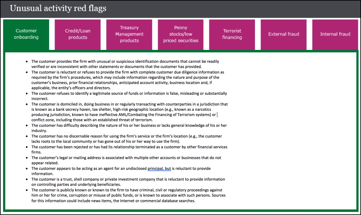
When taking eLearning compliance training for a project, I came across this screen. This is what is known as a tab layout, and this a good example of how not to use bullets in eLearning.
At first glance, you might think the tabbed format is perfect for this content — you have seven categories, so all you do is create the tabs and pour the appropriate content into the screens that are triggered by selecting the tabs. Recall, however, that this is in an eLearning compliance course. The goal is to have an employee recognize red flags and take appropriate action. So of course, every employee will have this eLearning open on their desktop, and refer to it in real time, right? Of course not!
This is a design that requires either a photographic memory or a very high engagement level. How often is that the case in employee training? The design is crowded and tedious. The large number of bullet points create an excessive cognitive load, with no connections or other aids that promote learning. I call this the “Container School of eLearning” — the design is based on the container rather than the experience learners require to understand and retain the information.
This design could be feasible as a job aid — assuming that some electronic device was accessible in real-time. But looking up a detail, or brushing up on a topic is different than learning it to begin with. This content was not designed as a job aid, and so is a good example of “appearing to be doing something” for both the instructional designer and the employee.
How would you design the content for retention and true learning? Not with death by bullets!
Note: I changed the content to reflect information that is publicly available on the Internet.
